You’ve probably heard of the popular saying “less is more.” This definitely applies to interior design. Some think bringing more design elements into a space will make it more interesting, but it often has the opposite effect. A room can quickly become cluttered and overwhelming when there’s too much going on. It is not the quantity that brings life to a room but the quality of the design elements. A home should reflect your personal style, not a copy and paste of what’s trendy.
To create a well-designed space, You must avoid these common design cliches:
Furniture Sets
Most people think making everything match is the way to go regarding furniture. It is not always the case. Mixing and matching different furniture pieces can add character and depth to a room. Creating a cohesive look does not mean everything needs to match perfectly. Instead, focus on complementing pieces that work well together. Furniture sets also tend to be mass-produced and lack individuality. Also, avoid too heavy furniture or large area rugs that can make a space feel smaller. Try to keep things light and airy. Heavy or huge furniture can make a space feel cramped.
Paint Colors
While you may love a certain color, it is important to consider the feeling it evokes in a room. For example, light colors make a space feel larger and airier, while dark colors can make a room feel smaller and cozier. When choosing paint colors, it is best to consult with a professional. They will be able to help you select the perfect shade that compliments your space. One of the huge mistakes is ignoring the color effect and psychology. Every color has a different message it sends out to the viewers. And using the wrong color in the wrong place can give a very unpleasant feeling. It also might make the space look cluttered and smaller.
All-White Everything
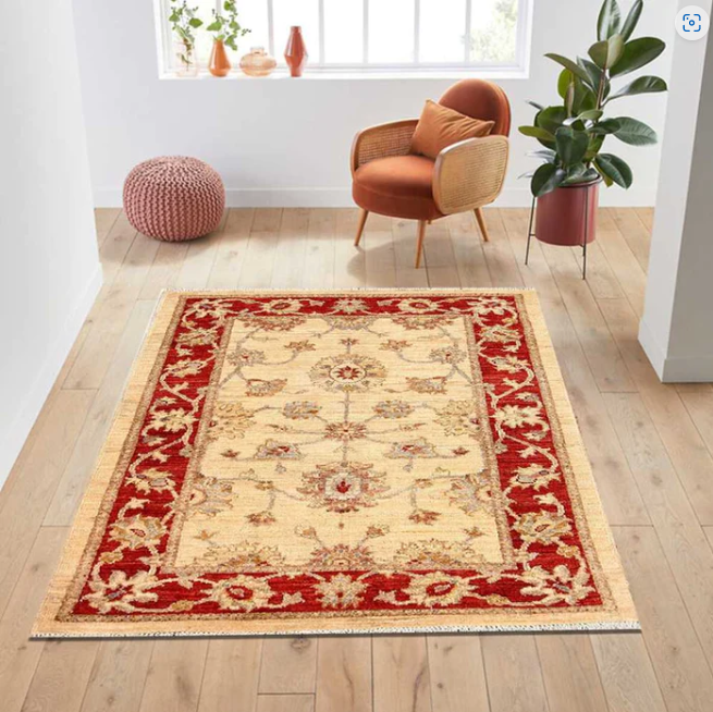
While an all-white room can look clean and fresh, it can also be sterile and uninviting. Adding some color or pattern will add life to the room. Even if you are going for a monochromatic look, adding different shades of the same color will add depth and interest to the space. An all-white room can also make it look like you’re trying to hide something. It will be much more inviting if you add some color. If you are a fan of dim shades, better to pair them with pastels. For example, a light blue wall with white trim or a white sofa with colorful cushions. You can pair the all-white interior with beige or ivory rugs for a bit of contrast. It will not overdo the space and still give a fresh look.
Too Much Matching
When every item in a room matches, it can look boring and uninteresting. A little bit of contrast goes a long way. Try pairing different textures, patterns, or colors together to create an interesting and unique space. Matching everything can also make a space feel small and cramped. For example, add a colorful rug or patterned throw pillows if you have a white sofa. Or, if you have a dark wood coffee table, consider adding a lighter-colored rug or sofa. Too much color is also bad, as it can be overwhelming and make a space feel small. Stick to a few colors that complement each other, and avoid using more than three or four colors in one space.
Relying on Trends
Just because a style is trending does not mean it will last forever (or even a year). When considering new pieces for your home, think about how long you want them. If you only plan to use something for a short time, it might not be worth the investment. If you are considering a more permanent piece, make sure it is something you Guest posting sites will still love in five or ten years. Designers say try to stay off-trend and focus more on what you love. And they say, “off trends is the new trend.” It is more about what makes you happy. The same goes for your home. It should be a reflection of you and what you love, not what is popular at the moment.
Overusing Mirrors
While mirrors are a great way to make a space feel larger, using too many of them can make a room feel cold and impersonal. Use them sparingly to create the illusion of more space and light but be careful not to overdo it. Mirrors can also add an ornamental touch to a room but ensure they are placed thoughtfully. A framed mirror above a console table can make a great statement piece. It is all about finding the right balance. A wooden framed mirror is a great way to make the space feel more natural and inviting.
Too Much Pattern
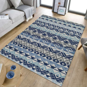
Patterns can greatly add interest to a space, but using too many of them can be overwhelming. Stick to one or two patterns maximum and use them in small doses. A patterned rug is a great way to add some personality to a room without going overboard. Use patterns sparingly on pillows, curtains, and other accessories. Also, avoid bright colors with huge patterns, as they can be too jarring. Big patterns can also make a room feel smaller. The key is to find a balance that works for your space. It’s also important to consider the scale of your patterns. Smaller patterns tend to be more soothing, while larger ones can be more energizing.
Matching Wallpapers
Wallpapers are making a comeback, but that doesn’t mean you have to match them. Mismatched or clashy wallpapers can add much visual interest to a room. If you’re not sure how to pull it off, start by choosing two or three different patterns that share a common color palette. Then, hang them in the same room to create a cohesive look. Using matchy wallpapers is a design cliche you should avoid. It can make your home look dated and uninspired. The pros know that mismatched wallpapers are much more interesting and can add personality to any space.
Too Many Throw Pillows
Another design cliche you should avoid is using too many throw pillows. Yes, they’re cozy and can add color and pattern to a room, but too many of them can make a space look cluttered and messy. When it comes to the pillows, less is more. Most people only need two or three per sofa or bed. Filling your space with too many pillows is a design mistake that’s easy to avoid. Also, avoid too many colorful patterns. It can make your space look busy and chaotic.
Summing Up!
Clichés can be helpful guidelines, but it’s important to avoid them when possible to create a unique and personalized interior design. We hope our list of interior design clichés to avoid will help you steer clear of some common mistakes and create a space that reflects your style. If you’re looking for some additional guidance on avoiding cliches or want help finding the perfect rug for your home, contact RugKnots today. With over 100,000 rugs to choose from, we’re confident we have the perfect piece to elevate your interior design game.


